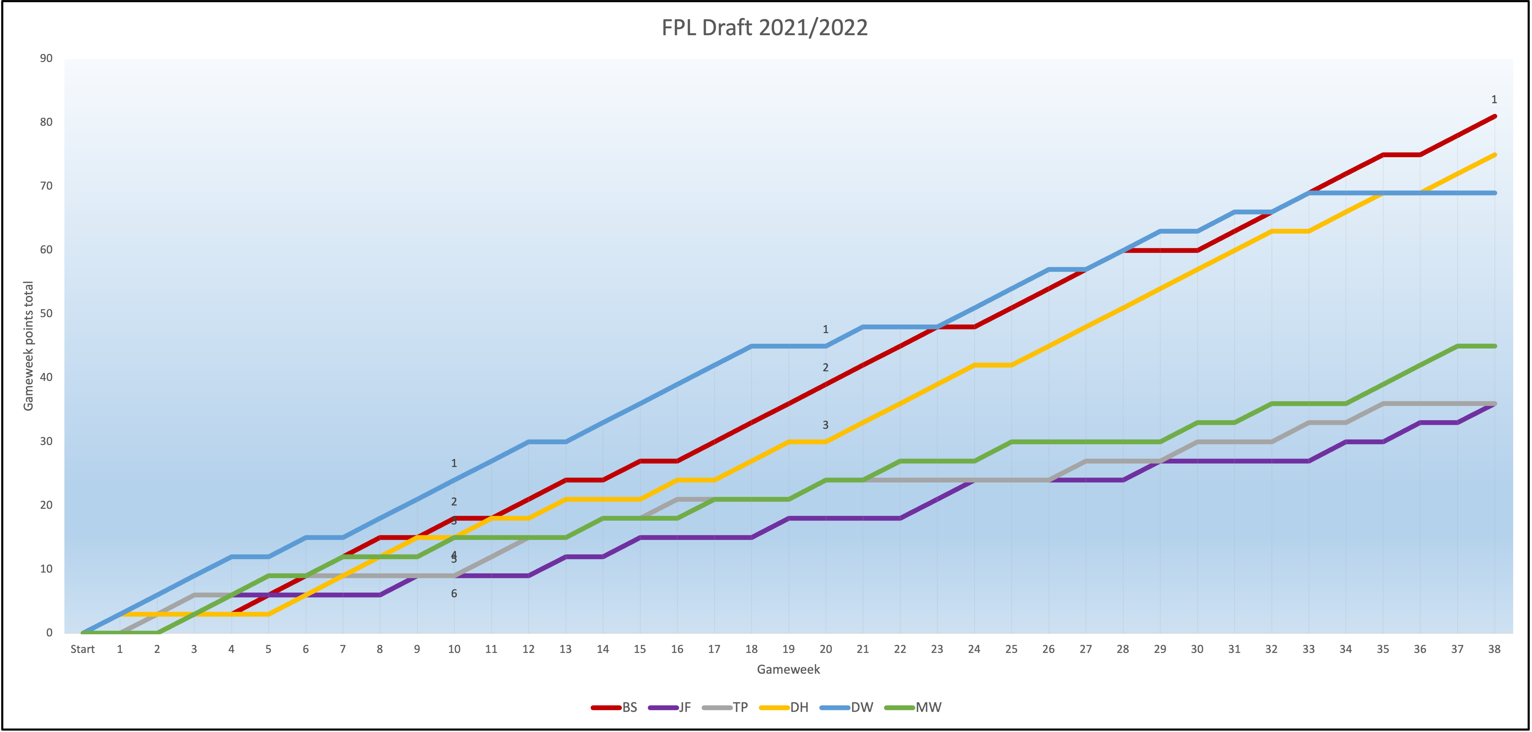
Using RStudio and Excel, I’ve generated several charts to illustrate some final scores from the Fantasy Premier League Draft that I played in with a few friends throughout the 2021/2022 season. Metrics including points scored, points conceded, points difference, ranking, and overall league points were generated into long form in Excel as the 38 gameweeks progressed.
The first chart was issued in Excel and was steadily created as the data was collated into the spreadsheet. It follows the overall league table throughout the season, with the colored lines representing the gameweek points total which indicates the overall ranking of each team. An uninterrupted and steeply angled line illustrates consecutive wins for the selected team.
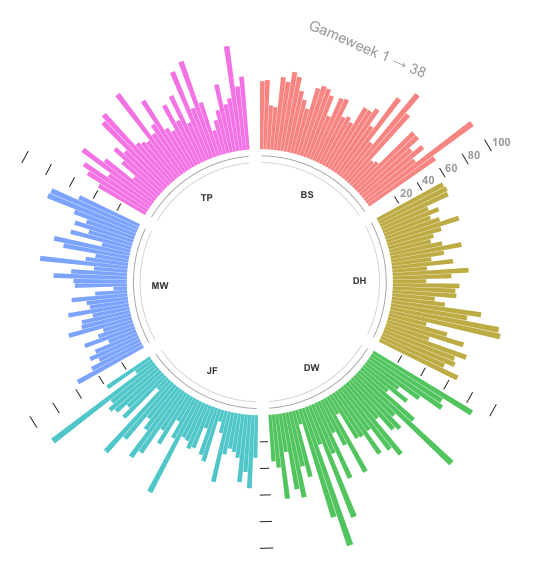
Moving to the charts generated in RStudio, the first depiction includes a circular bar chart of the overall points scored for each team. The usefulness of this chart is how it illustrates so many totals in such a small area, for example DH scoring over 50 for the first three gameweeks, whilst also offering the data in an easily viewable mode.
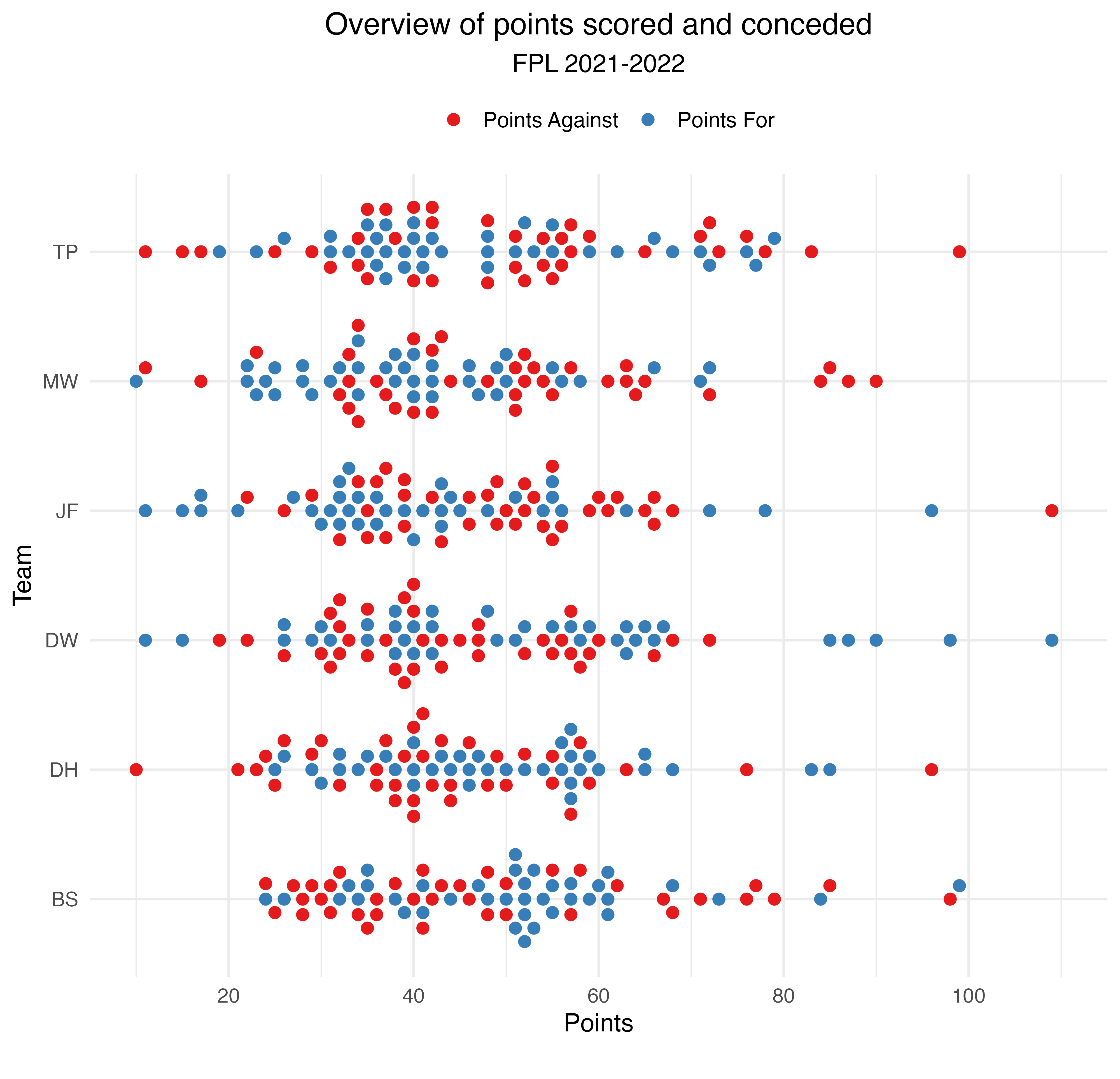
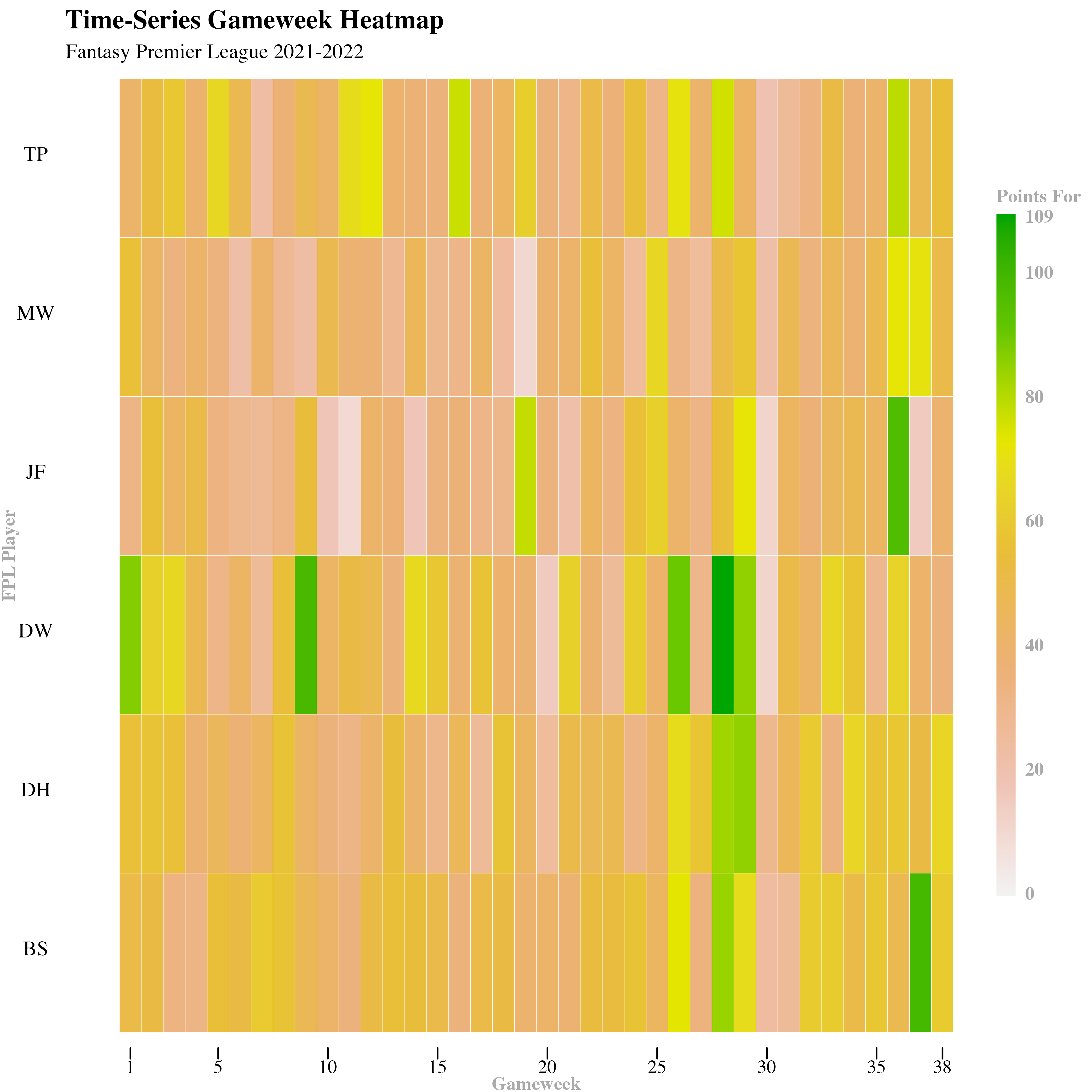
The time-series heatmap below uses the same data as the circular bar chart, but a continuous scale is applied to the data display. It might be a little more difficult to highlight a specific point score, but it is useful in showing general trends across multiple gameweeks, such as DW’s high scoring between week 25 and 30. This was made using the geom_tile function and the Color Brewer package.
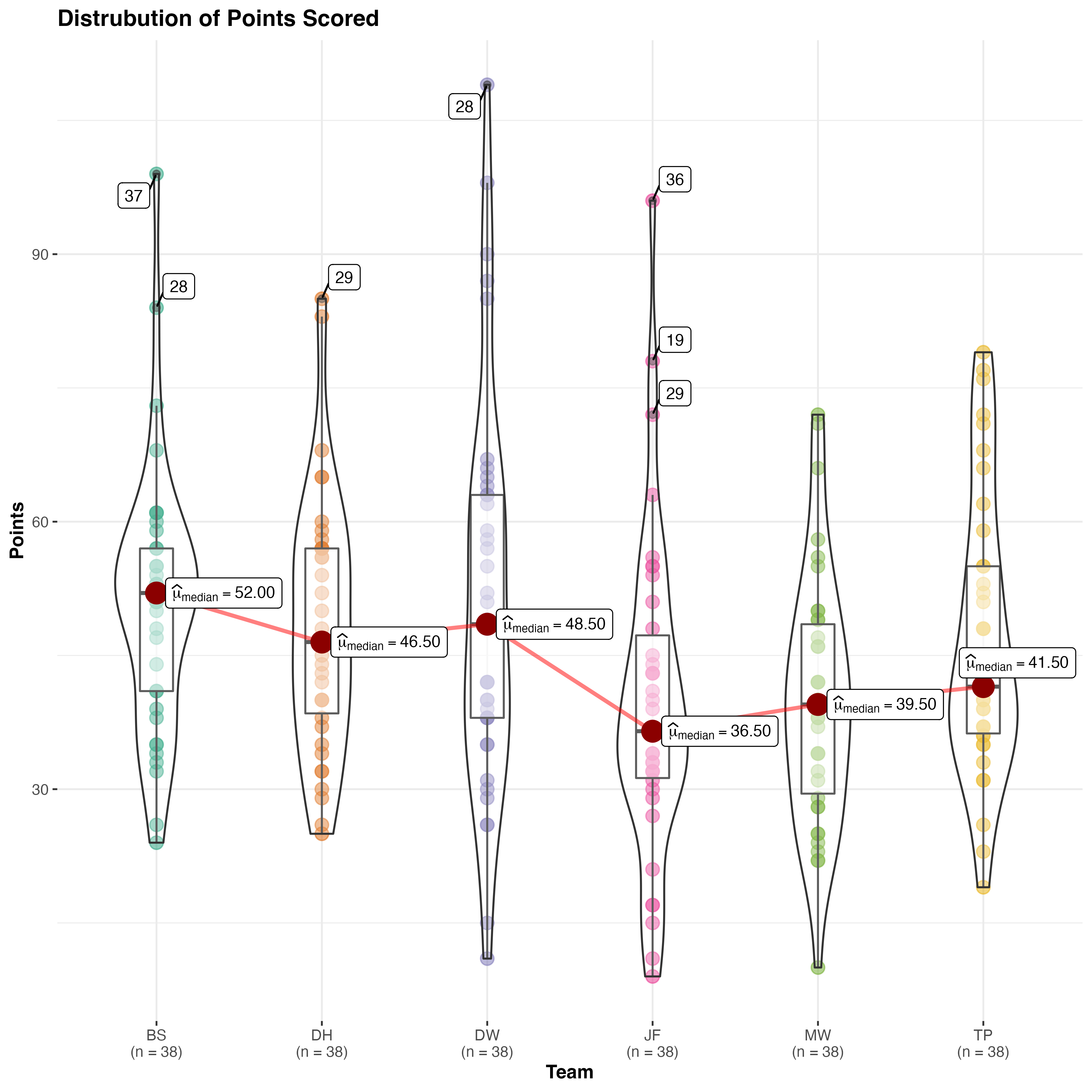
Using the ggstatsplot package, I’ve generated a violin plot of the points scored throughout the season. This chart is useful for identifying the clustering of scores, such as JF at around 45 points, and also the median for each team. In this case, n denotes the number of game weeks in a Premier League and Fantasy season, and I enabled the outlier tagging to show when each team hit their single highest total.