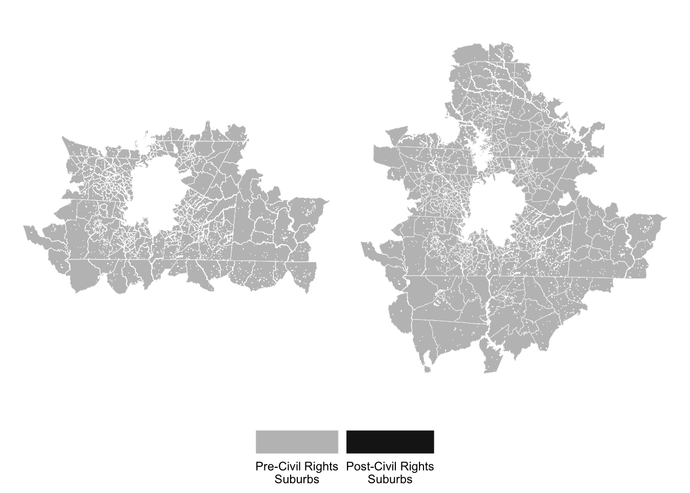
Charlotte
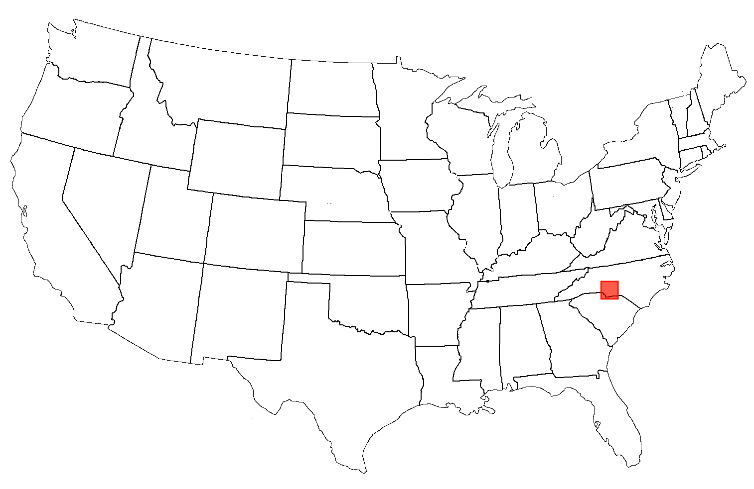
The first case study location includes Charlotte, NC. Charlotte was chosen as a sunbelt location which has demonstrated huge growth in its total population and geographical size, with this story illustrated throughout the figures below. The results below are broken down by suburban definition but first, the spatial boundedness of Charlotte and its change throughout the decade is mapped.
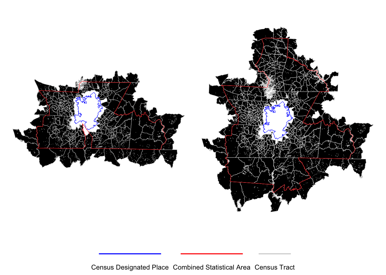
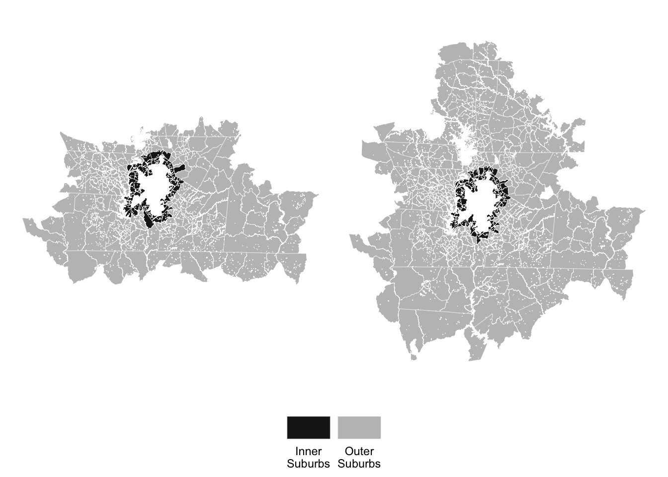
Charlotte and its suburbs
Census-Designated Suburbs
Distance-Defined Suburbs
Age-Based Suburbs
Changes in Population
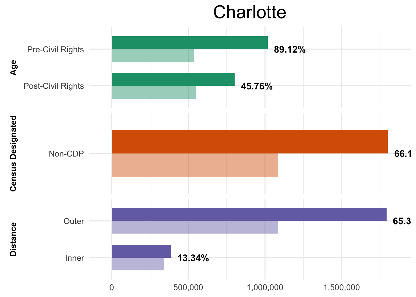
Total Population
The total population is considered as an aggregate of each suburban space. Figure 4 shows the population total in 2011 with the total in 2021 displayed above.
Changes across race/ethnicity
Taking a closer look at race/ethnicity, the change in each group is shown in Table 1 below. This table demonstrates the percentage change in the total population of the four major groups with others categorized as small group.
| Suburban | Type | NH-White | NH-Black | Hispanic | Asian | Small Group |
|---|---|---|---|---|---|---|
| Age | Pre-CR | 64.45 | 87.96 | 105.45 | 171.47 | 19.60 |
| Post-CR | 52.07 | 38.82 | 104.81 | 153.58 | 30.92 | |
| Census Designated | Non-CDP | 57.77 | 70.20 | 104.45 | 158.55 | 30.92 |
| Distance | Inner | -10.05 | 42.49 | 40.70 | 60.89 | -36.11 |
| Outer | 57.09 | 69.75 | 102.23 | 153.58 | 30.92 |
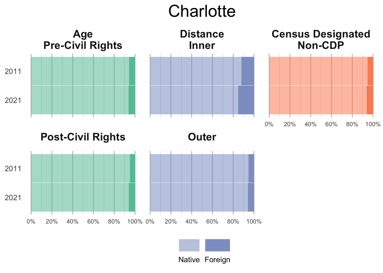
Native and Foreign Born
Below includes the proportion of native and foriegn born populations across each suburban setting in Charlotte. Data for 2011 are situated above 2021 in each chart for easier comparison. Notably, the foreign-born population increases across all definitions, but most strongly in the inner suburbs.
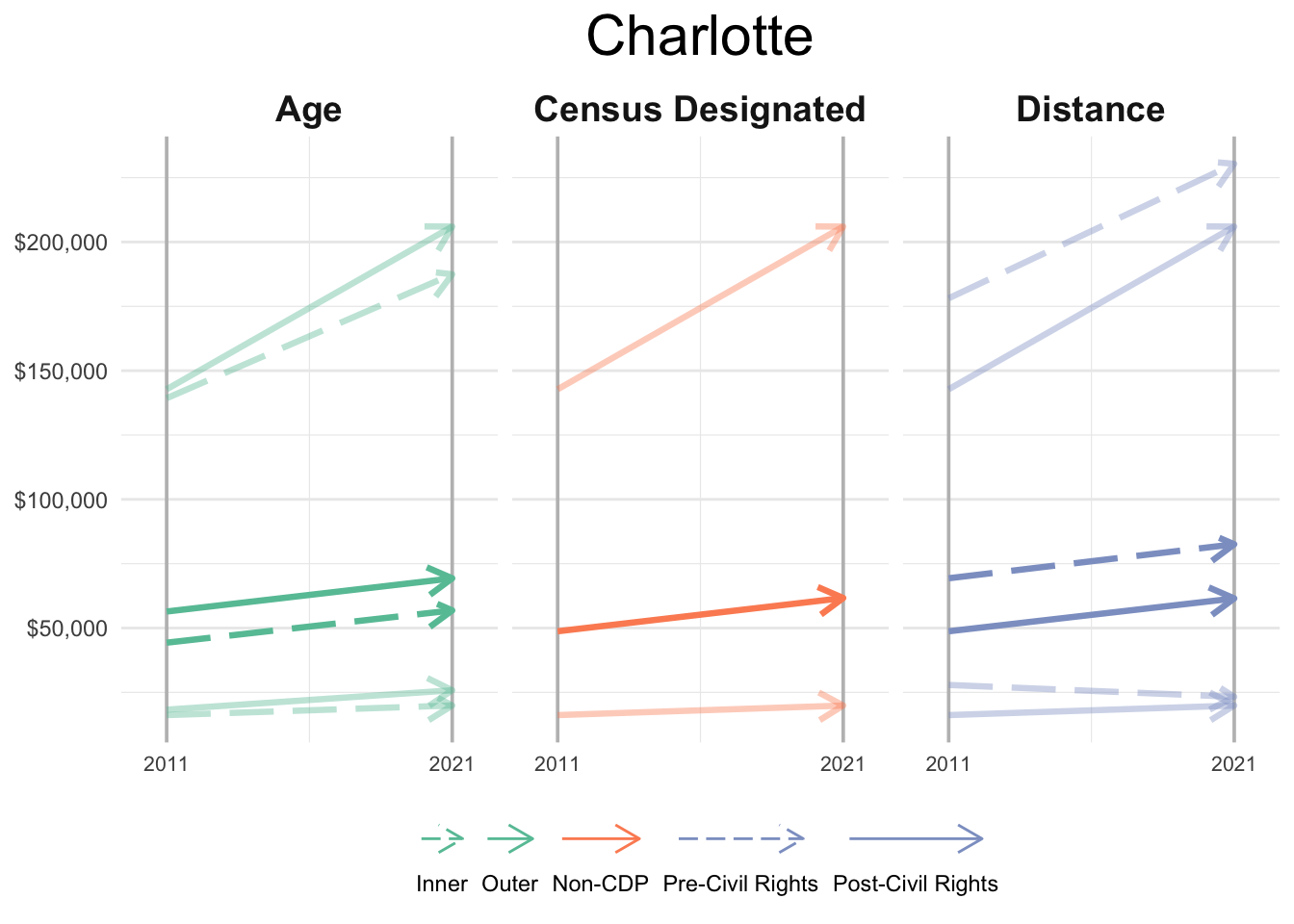
Median Household Income
Figure 6 below illustrates how the household income at tract level has changed throughout the ten-year period. The line chart shows the tract with the lowest and highest median household income in Charlotte, and also the median value too.